
Listen. Design. Iterate.

Mobile app
Website
watchOS
TRACK TIME EFFECTIVELY
BACKGROUND
MY PERSONAL STORY
With 6 years working in public accounting, I have experienced the struggle of tracking time spent on each project to report on daily timesheets. This is an issue that I think still hasn't been properly resolved. Most professional services companies only have a timesheet submission software, and it's up to the employees to track their time during the day. My coworkers and I have used pen and paper, digital notepad, or Excel, but the process is manual and there's a lot of guesswork involved.
PROJECT BRIEF
-
Project type: individual
-
Deliverables: mobile app, responsive marketing website, some watchOS screens
-
Duration: 8 weeks
-
Skills: UX research, UX writing, UI design, usability testing, accessibility testing, interaction design, website design, watchOS design
-
Tools: Figma, Adobe Illustrator
This is what I did on a daily basis as a tax accountant. Typos were common when I tried to rush typing to get back to actual work.


But I didn't design an app to solve my own problems.
This is an app for everyone in professional services - accountants, consultants, designers, advertisers, marketers, agencies, freelancers, you name it - because if there's one thing we all have in common, that is we all have to track time and we all hate it (and yes, I have the research to back up my claim).

FIRST, I RESEARCHED ONLINE.
@jeshoots (Unsplash)
According to a study published on Harvard Business Review, inefficient time tracking hurts the economy, business performance, and people's mental health. Employees report time stress and increased impatience.
Putting a monetary value on people's time is somewhat dehumanizing in my opinion. To quote Dr. Sanford DeVoe, Professor of Organizational Behaviour at Rotman School of Management:
"Having this monetary value on time can make you more stingy with your free time...and more likely to focus on economic factors when you're evaluating your overall life satisfaction."
But that's what the industry is, so how might we help them?

How might we make it easier for professional services to accurately fill out their daily timesheets
so that
they don't feel it is just another chore?
My hypothesis is that if the whole timesheet experience is quick, easy, and rewarding, they will no longer find it painful. I will know this is true when the usage of my app actually leads to positive timesheet experiences from the users.
But before diving into this issue, I stopped and asked myself 'do people already have solutions though?' because after all, this is not a new issue. Sure enough, there are productivity apps that revolve around the idea of listing a bunch of projects and putting a timer next to each one to track it. But if there were solutions, why did the time tracking issue persist? I didn't know, so I asked people.

PRIMARY RESEARCH: I INTERVIEWED 9 PEOPLE.
The optimal number for qualitative interviews, according to Nielsen-Norman Group, is 5-7 because after 7, the usability curve starts to flatten. However, I wanted diversity to get out of my biased zone, which was tax. I didn't want to design an app for myself and my friends. As such, I interviewed 9 people from various fields within professional services.
1 Consulting - 2 Tax - 1 Technology - 1 Finance - 1 Marketing - 3 Audit
As different as the interviewees were, they all mentioned 4 common themes.

Icons by iconcheese from the Noun Project
With these interview insights, I developed the primary persona for this project.
PERSONA
May (29), Advisory Manager in Toronto
May works in consulting and has to handle client billing as a manager. She tries to track her hours for each project and motivates her staff to do the same.

GOALS & MOTIVATIONS
-
Needs to do timesheets daily and accurately to bill clients correctly
-
Has her bonus tied to timesheet compliance
-
Wants to see more “rewards" from doing timesheets rather than trying to avoid “punishments"
BEHAVIOURS
-
Tries to track time every half hour in a spreadsheet
-
Usually forgets to log time spent on answering questions from coworkers and emails from clients. which results in guessing and rounding time logs
-
Spends 12-15 minutes doing timesheets at the end of the day
PAIN POINTS
-
Struggles to find a digital solution that tracks time during the day and synchronizes with the company software
-
Busy with meetings and calls, which interfere with time-tracking
-
Misses timesheets sometimes because of her busy schedule and fails to make an example for her staff
TASK FLOW
From the persona's experience, I authored several user stories and identified the core epic of effective time-tracking, which then developed into 3 core product features. When ideation was done, the Design phase began.


COMPETITORS
For inspirations, I downloaded the competitors' apps and also found a similar case study from another UX designer on Dribble. However, the way all of those apps presented the timer on their home screen was confusing to me. Below is an example from Toggl Track. If you look at this screen, how do you know, right away, what project you need to tap on to start the timer?

Screenshot from Toggl Track
INSPIRATIONS
Instead of vertically stacked rows, I wanted the projects to be organized into categories, each of which would have a carousel design similar to the app Calm below. When May is busy multi-tasking and needs to switch back and forth between projects, she would look at her phone and know within 1 second what she project she wants to tap on.

Screenshot from Calm
SKETCHES
From the UI inspirations, low-fidelity sketches were developed around the main product function in the task flow. The sketches are for the 3 main features: 1) Home page with a Timer, 2) Projects page where the list of projects can be edited, and 3) Reports page where May extract her timesheets.

PROTOTYPE V1
The first version of the product was designed in the same direction of the sketches. The distinguishing carousel design of the Timer/Home screen would set newtimer apart from its competitors and help May track her time more effectively.
But of course, V1 was not good enough, so I proceeded to testing and iterating.


USER TESTING
TEST PLAN
I conducted 2 rounds, each with 5 testers. Each session lasts 20-30 minutes. I transcribed everything that the testers said, summarized them and then put the comments on a design prioritization matrix for each round.
-
Round 1 - internal testing: The 5 testers are fellow UX designers, who offer more feedback on visual design.
-
Round 2 - real-world testing: The 5 testers are actual professional service workers in various fields (tax, technology, consulting, marketing, design). I recruited these testers to learn how actual users from various industries would interact with the product.
ROUND 1 RESULTS
-
Projects screen looked too much like Timer screen and caused confusion
-
Some icons were confusing, especially the microphone icon on the Timer screen.
-
Location of current project's timer was inconsistent - top on Timer but bottom on other screens.
-
The top bar was crowded and unclear.
ROUND 2 RESULTS
-
Most testers looked for monthly or yearly reports.
-
Some testers wanted to see a clear notification when the timer is switched to a new project.
-
Some testers looked for a way to import projects.
-
“Choose date" CTA was too small, and the calendar icon on Reports was confusing.


FINDING THE TONE
After the mid-fi grayscale prototype has been tested twice and gone through 3 iterations, I started developing the visual identity.
The first step was to gather a moodboard for inspirations. The moodboard went through 2 iterations. At first, I wanted a calm, relaxing beige/wood tone from the Marie Kondo brand, but then I injected the complementary blue/teal for diversity. The final tone is tranquilizing yet liberating. Newtimer sets May free; it's a silent timer running on the background, not a clock ticking on the wall.

Photos from Unsplash
VISUAL IDENTITY
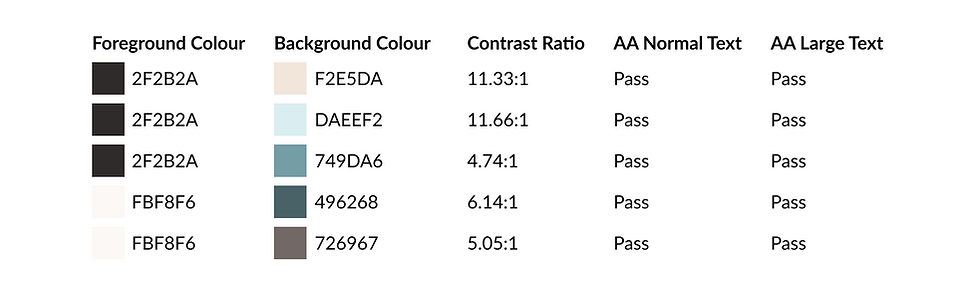
The visual identity of the brand follows the tranquilizing, liberating tone by using a light, neutral primary palette. Typography is functional and readable rather than expressive and punchy. Throughout the whole visual design process, I always checked for accessibility to make sure the visual theme would pass WCAG standard AA.

FINAL PROTOTYPE
UI LIBRARY
After the hi-fi prototype was completed, I compiled all UI elements into a library using Brad Frost's approach (atoms, molecules, organisms, templates, pages) along with specs for development hand-off.
After the product has been designed, the app is close to be launched, so a marketing website is needed. I designed a responsive marketing website that would be visually appealing in both desktop and mobile viewports.

The next realistic step for this project would be to venture into more platforms, especially the watchOS. The carousel design would work well on the limited Apple Watch screen. To compensate for the lack of categories, voice interaction might be introduced so that May can say "start the timer for project A" or "stop and switch to project B." This feature would offer a hands-free experience, which is the future of UX.


KEY LEARNINGS
-
Listening to the users takes time. It's a continuous, fluid conversation.
-
The Listen. Design. Iterate. process is never linear.
-
Developing the visual identity for a digital product takes a lot of revisions. A lot of my time was spent on looking for inspirations and tightening the moodboard before turning the design into high-fidelity.