Mobile app
HEALTHCARE TRANSPARENCY
FOR IMMIGRANTS
BACKGROUND
MY PERSONAL STORY
As a foreigner who has lived in the U.S. and Canada, I feel a strong connection with other immigrants who struggle to start a new chapter of their lives in a different country. Immigrants face multiple challenges in their healthcare experience and often take a few years to adjust.
PROJECT DESCRIPTION
-
Project type: individual
-
Deliverables: mobile app prototype
-
Duration: 3 weeks
-
Skills: UX research, UX writing, UI design, usability testing
-
Tools: Figma

RESEARCH
ONLINE RESEARCH
According to a researched titled "Migration and Health in Canada: Health in the Global Village," new immigrants are twice as likely to have difficulties in accessing immediate care as those born in Canada. Immigrants face multiple barriers that hinder their accessibility to fast and reliable healthcare, especially during the first few months of their arrival and settlement in the country.
ASKING NEW IMMIGRANTS DIRECTLY
Primary research was done with 3 in-depth interviews. The 3 interviewees were immigrants with different visa and marital statuses because the healthcare experience would be different for each.
-
International student, single
-
Work visa holder, married, no child
-
Spouse of international student, married with child
INTERVIEW SYNTHESIS
3 themes arose from the interviews:
-
Registration Efficiency: Immigrants suffer from the bureaucratic registration process and want to get healthcare access quickly.
-
Information Transparency: Immigrants want to be equipped with information before, during, and after the healthcare experience.
-
Cost Fairness: Immigrants have to endure extra costs because they have a different healthcare package than the rest of the community.
HOW MIGHT WE
I chose to focus on the theme of Information Transparency because it would allow for a digital solution. The Registration Efficiency and Cost Fairness issues might require policy changes that are beyond the design intervention.
How might we increase the healthcare information transparency for immigrants in Canada so that they feel confident using healthcare services?
PERSONA
Keen Kim
Kim moved from Vietnam to Canada to pursue her master's degree in music composition at York University. She is passionate about her craft and has a busy practice schedule. Kim has a mild, chronic pain and doesn't want it to get in the way of pursuing her dream. She wants her healthcare experience to be seamless and affordable since money is tight for international students.

GOALS & MOTIVATIONS
Stay healthy to pursue her passion
Feel a sense of belonging in her healthcare experience in Canada
Have clear information on hand about costs and coverage so she can make decisions quickly
Help other immigrants
BEHAVIOURS
Searches for healthcare providers on her smartphone when stomach pains interfere with music practice
Asks her Vietnamese friends in Facebook messenger
Posts a question to the Facebook group of York University students
PAIN POINTS
Confused about the student visa healthcare coverage and wants to see ratings of providers based on their familiarity with immigrants
Wants to see more information in her first language
Frustrated about the lack of online information, which results in multiple long calls about extra costs

SKETCHES
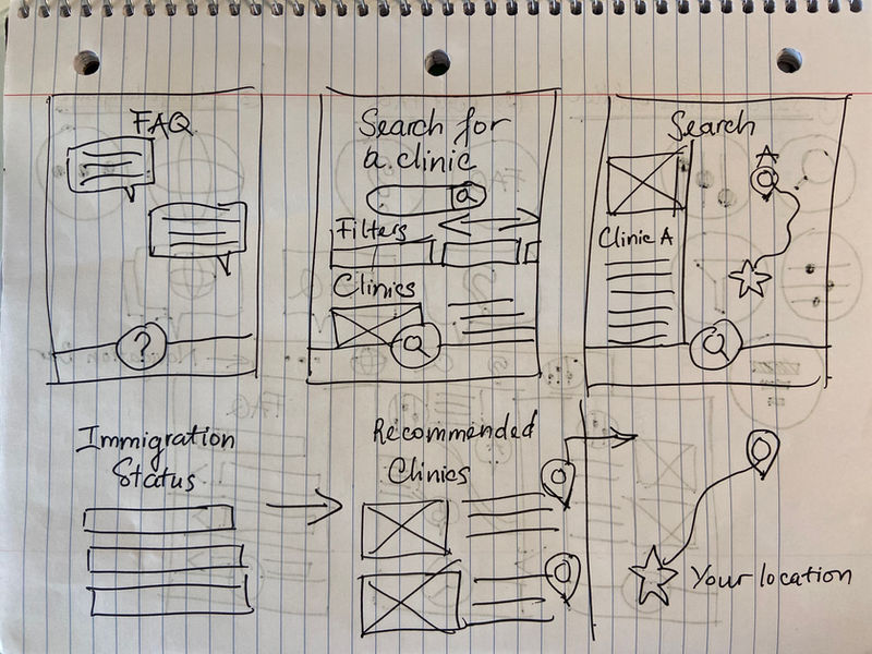
Low-fidelity sketches were developed from the persona's user stories. These user stories were organized into epics, which were developed into 3 core product features: 1) Searching for providers based on their immigrant-friendliness, cost, and insurance acceptance; 2) Reading frequently asked questions for new immigrants; and 3) Changing the language.
In order to draw the sketches, I looked for UI inspirations and gathered the relevant elements in this InVision board.
PROTOTYPE V1
The first version of the prototype was developed based on the 3 core product features.
Kim would be able to search for a healthcare provider based on their immigrant-friendly and insurance acceptance.


In addition, the app would allow her to search for healthcare FAQ's and change all the app language to her native tongue.


USER TESTING
TEST PLAN
I conducted 1 round of 5 testing sessions. All 5 testers went through the 3 tasks (search for immigrant-friendly clinics, read healthcare FAQ, and change the app language). The testing results are put into a prioritization matrix (user value versus effort to change). I then made the high-impact changes along with low-hanging fruits.
HIGH-IMPACT CHANGES
-
Confused about globe icon and can't change language
-
Confused about the filter icon
-
Assume users can also sort, not just filter
-
Expect a search bar
-
Expect to be able to click/tap either on the map pin or the image of the doctor
-
Want to see a button to book an appointment
LOW-HANGING FRUITS
-
The word “clinic" doesn't fit the list of doctors
-
The filter should have a confirm button
-
Can't see a dot indicating her own location and the distance to the provider
-
Confused about the UHIP/OHIP toggle on the specific doctor - looks tappable but not
DESIGN PRIORITIZATION MATRIX
I put all testers' comments into a prioritization matrix and only focused on changing the high-impact changes and low-hanging fruits.

PROTOTYPE V2
KEY LEARNINGS
-
User Research: Raw interview answers are not linear even if the script is divided into sections. Conversations are more natural and fluid.
-
User Testing: The users' confusion about the globe icon doesn't necessarily mean another logo should be redesigned, but rather where regular users would go to achieve this. It shifted my way of thinking and if I had more time to revisit the prototype, I would get rid of the Change Language icon altogether and put it under More (three dots icon). It's just a one-time change and can be hidden away.


